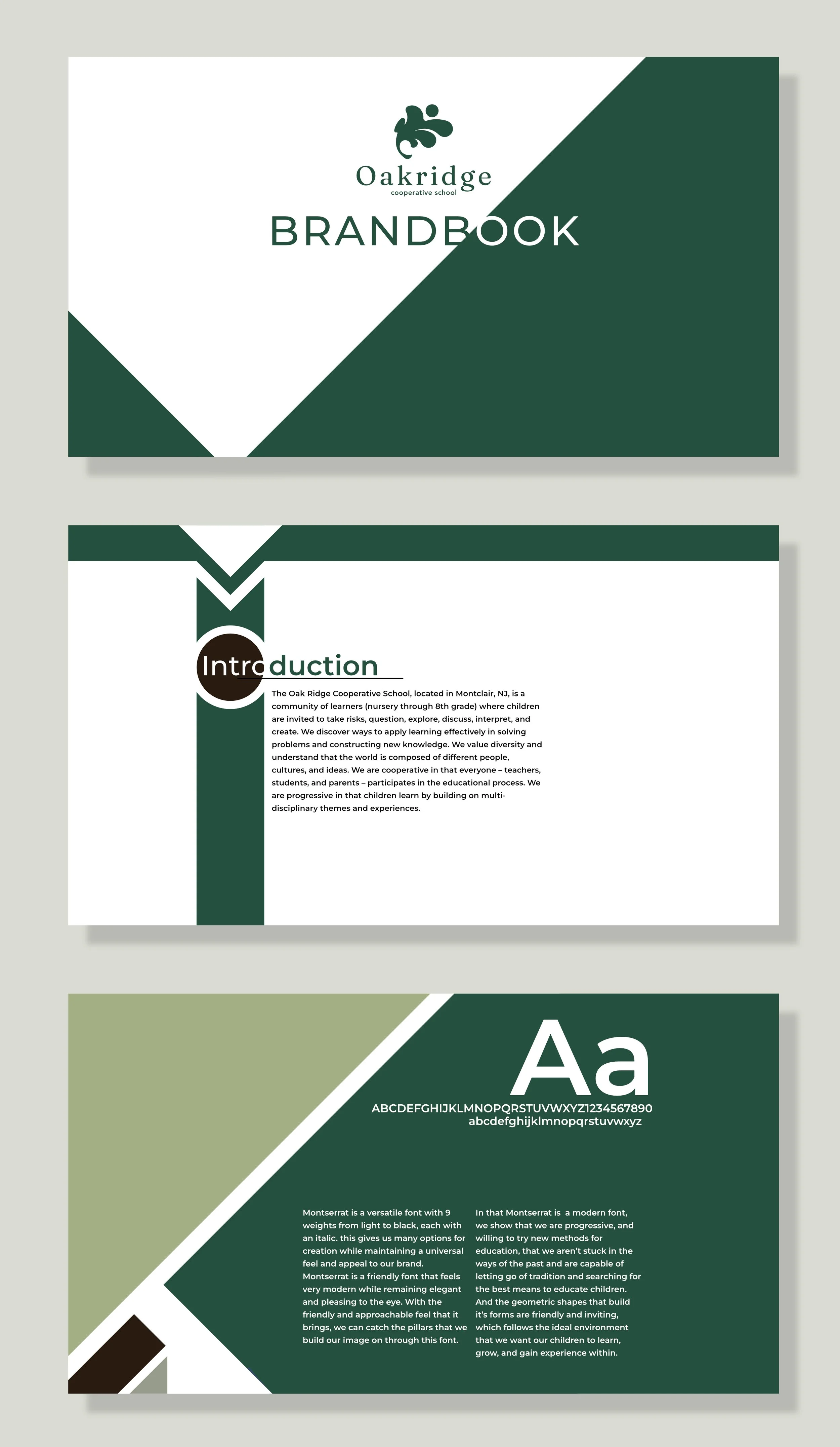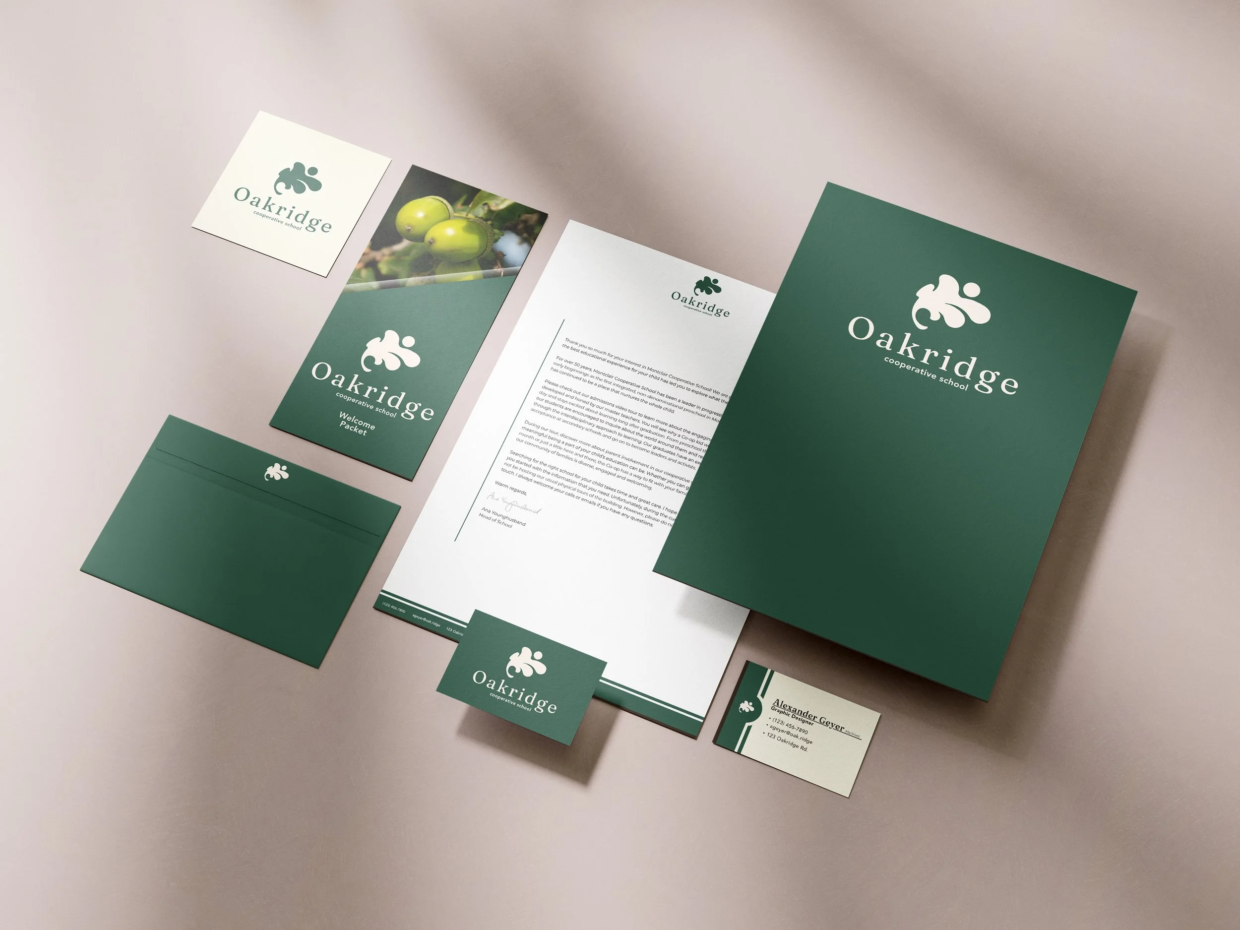
Oakridge
Revision to a student graphic design project - 2026
This student project was originally created in 2022, however I revisited it and reworked it from the ground up in 2026. It features a stationery set and brandbook. With the name Oakridge I wanted to use the shape of an oak leaf, which are varied in nature, and draw parallels to the growth of a child who would be going to the school. So I wanted the logo to be energetic, with a representation of a child reaching out, while keeping it sophisticated. Pairing it with a serif title font, and a sans serif body font.